Question: I’m in the planning stages of a home renovation, what are some of the new trends in interior design – and what should I stay away from?
Answer: Redecorating and home renovations are an exciting and fun task but you want to make sure you don’t make choices that date your home. Each year designers and architects release their favorite new trends, including what to stay away from when undertaking a home makeover. This week I have compiled the latest do’s and don’ts for kitchens, bathrooms and living spaces from Elle Décor, Houzz and realtor.com.
Color(s) of the Year
Each year people in the design world await Pantone’s announcement for color of the year. This year they announced the bright and fresh, Living Coral, but they are no longer the sole source for color trends. Recently other paint manufacturers started sharing their own selections for a color of the year, with Sherwin Williams choosing Cavern Clay and Behr announcing Blueprint.Kitchens
In:
- Blue Kitchens — Blue toned cabinets paired with brass or gunmetal hardware creates a warmer and more welcoming space.
- Black Kitchens — Black feels fresh and crisp and can be paired with a wide variety of hardware to accent. However, this does not mean the return of shiny black appliances! Most brands have introduced matte black or a dark stainless steel line.
- Two-tone Cabinets — Green/grey/blue bottom cabinets paired with white upper cabinets. Creating the warm and inviting feel of the blue-tone cabinets without going “all-in.” Should be paired with understated and simple hardware.
- Full Wall/Bold Patterned Backsplashes — Full-wall backsplashes are creating the ultimate statement kitchen. Especially when paired with a bold patterned tile.
Out:
-
Industrial Kitchens — Send my apologies to Joanna Gaines, rustic concrete countertops and exposed shelving with iron pipes are on their way out.
-
Solid White Countertops — With white walls coming back into style the white on white on white is almost blinding, especially when walking into a home with a lot of overhead lighting.
-
Over-the-range Microwaves — Originally coming into the scene as a way for developers to cut costs on kitchen remodels, this was never meant to be a trend and its demise is long overdue. Instead go for a sleek and stylish range hood.
-
Cherry Cabinets — The overall of these emerging trends seems to be brighter and lighter and cherry cabinets darkern a kitchen no matter what wall color or countertop you pair them with.
Bathrooms
In:
- Floating Vanities/Sinks — A floating vanity creates the illusion of more space which can open up an already small bathroom.
- Wall-Hung Faucets — Not only does this create more counter space, but it makes for a sleek and modern bathroom.
- Matte Black Hardware — Simply put, they are sleek and stylish.
- Pewter + Gunmetal Hardware — Brushed over shiny metals help keep a natural tone to your bathroom.
- Exposed Plumbing — Brings a rustic yet stylish pop to your shower.
- Patterned Floor Tiles — These add texture to a normally “flat” space. My personal favorite is the herringbone pattern.
Out:
- Direct-Install-Showers — While this may be a more cost effective option, these showers start to look dingy, quickly. A tile shower will add more value to your home.
- Glossy Finishes — While this would make the perfect setting for a Mr. Clean ad, more natural materials with earth tones will help you create a bathroom that feels like a spa.
- Metallic/Mirror Tiles — What started as an idea to add more light to small spaces, this trend has ended almost as soon as it started. You’ll grow tired of this tile quickly and it will not age well.
- Oversized Tubs — Taking up valuable space in a bathroom — while they sound nice, they are rarely used.
Living Space + Bedrooms
In:
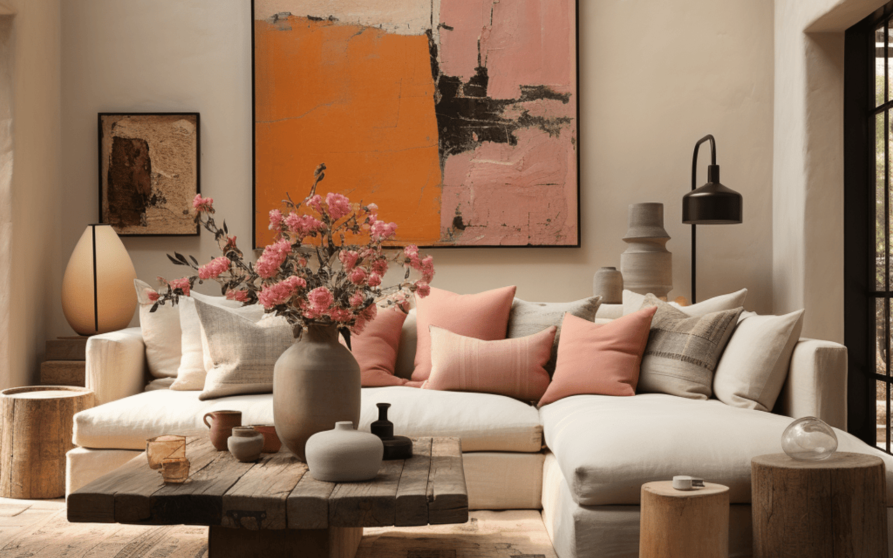
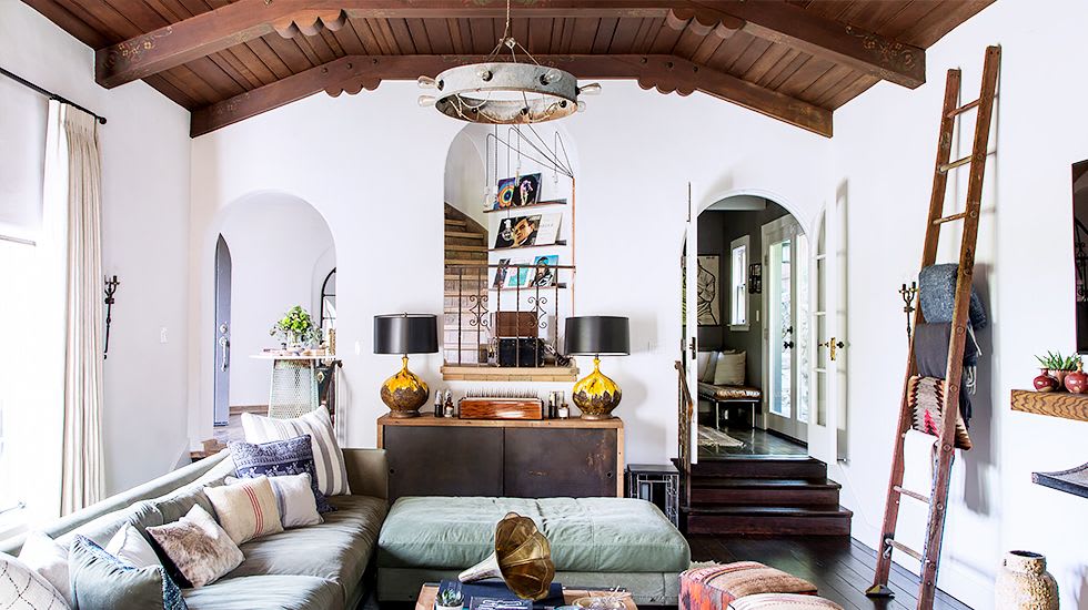
- Spanish-Style Décor — Natural earth tones for walls and flooring paired with warm colored furniture and accessories.
- Memphis Design — With graphic shapes and primary colors, this trend is replacing the midcentury trend.
- Biophilia –– Referring to a human’s desire to seek connection to nature, biofilic design is bringing elements of nature into your home. From plants to natural materials like bamboo flooring.
- Lightwood Floors — Nothing brightens up a space like light hardwood floors. Depending on quality, these will generally show less ware and tear over the years as well.
- Less Is More — Purposefully purchased and strategically placed decor with natural tones.
Out:
-
Grey Everything — This trend has had a long run but it creates a cold and uninviting space. Opt for warmer neutral colors for your living spaces.
-
Rose Gold — This trend has slowly fizzled over the last year or two. Its demise is mostly due to the fact that it does not integrate well with other metals in your home. You should opt for something more timeless like brushed gunmetal or antique brass.
-
Gallery Walls — Uniform frames hung in a dispassionate manner don’t add character to a space. Instead go for a mix of frames in different shapes, materials and sizes hung in a purposeful but not overly organized fashion.
-
Boho Accessories — While a boho accent or two is not bad, people tend to go overboard with this trend, creating an overpowering and loud space. No more boho tapestries please!
-
Midcentury Everything — While the furniture may not be uncomfortable, it looks uncomfortable. Mixing design trends can make a space look more inviting and less like a time capsule from the 50’s. Joybird offers a great twist on midcentury style furniture that help break up with overpowering trend.
-
Eclectic Clutter — We love our stuff but it can become overwhelming, especially in small spaces. Dubbing this one the Marie Kondo Effect.
-
Succulents — Coming off of huge spike in popularity, succulents miss the mark in biophilia. Most look fake even when they’re real, you should opt for leafy and lush indoor plants.
